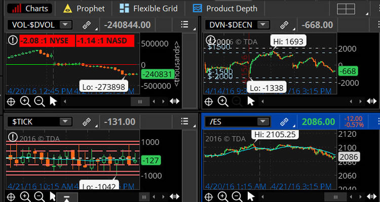
Think or Swim Internals Chart
Market Internals can be used to give you an overall feel of the market direction. The market internals are similar to a compass or the instrument panel on your car. The internals can give you a sense of the speed and direction of the market. The internals can give you the overall strength or weakness in the market. This can help you determine if you are neutral, bullish or bearish. Then you can plan your trades according to your market bias. The internals are used for the most part for the equities markets. There are several market internals which can be tracked; this article is based on the NYSE.
Much of this material was put together from information provided by Peter Reznicek, from Thinkorswim's shadow trader. The title of the webinar is “How to Trade with Market Profile and Market Internals”.
Up Volume vs. Down Volume Chart or Breadth Chart
The first chart to set up in your grid is the $UVOL-$DVOL 15 minute chart. Here's a link which will bring you to the script to get the breadth ratio box: http://theinfinitygroup.us/script/. This chart allows you to see the breadth of the market. $UVOL-$DVOL measures the amount of volume moving into stocks which are increasing in value to the amount of volume moving into stocks which are decreasing in value.
You can get a sense of the market by looking at the ratio of the $UVOL-$DVOL. If the ratio is plus 2 to 1 or greater, the market could be considered to be bullish. If the ratio is negative 2 to 1 or greater, the market could be considered to be bearish.
Advance Decline Line or AD Line
The $ADVN-$DECN or advance-decline(AD) line is the next chart to set up in your grid. It tracks the NYSE. Use the 15 minute time frame for this chart. The advance-decline line chart looks at the difference between the number of stocks which are advancing minus the number of stocks which are declining.
When the price action is hovering around the zero line on the AD chart it usually shows a market with very little confidence.
A strong reading on the AD line chart is usually above the 800 or 900 level. Extreme readings are around the 2000 area. Reversion to the mean days will be around the plus or minus 500 area and the price action will be oscillating above and below the zero line.
If the chart level reaches the plus 1500 area, the market can be considered to be bullish. If the chart level reaches plus 2000, the market can be considered to be very bullish.
If the chart level reaches the negative 1500 area the market can be considered to be bearish. If the chart level reaches negative 2000, the market is considered to be very bearish.
The TICK Chart
This chart tells you how many stocks are trading on an uptick verses the number of stocks trading on a downtick at the exchange level. To find this in TOS (Think or Swim) go to charts and type in the symbol $TICK. This tick chart is looking at the NYSE. Many traders use either the 5 or 15-minute chart. Some important levels on the chart to consider are the plus 800, the plus 1000, the negative 800 and the negative 1000.
The tick chart many times is used to gauge very short term market extremes. The tick chart readings usually range between the plus 700 to plus 800 to minus 700 to minus 800. When you see plus or minus 1000 on the tick chart, this can be considered to be a large extreme. Usually, these large extremes signal a short term reversal may be coming. Many times day traders will use these extremes to see when a short-term market reversal may occur. Some say the tick chart is one of the most important tools for day traders.
Tips to Read the Tick Chart
The tick chart for some day traders is very important. The tick chart can affirm or deny how a trade progresses before or after you enter a trade. You can use the tick chart to monitor your trade.
On strong trending days the tick chart will read plus or minus 1000 multiple times. The tick chart is the fastest of the three market internals.
To get a feel for the tick readings look at the body of the candle to see if most or all the candle is above the zero line or below. This will give you a sense of the market. If the candle bodies are mostly above the zero line it can signal a bullish bias. The opposite can signal a bearish bias.
The 5 or 15 Minute Price Chart
When you set up the price chart of the underlying many use /ES; some use SPY, SPX, etc… Many traders use a 5-minute chart or a 15-minute chart. I like to use the 21 EMA. Some use pivot points on their price charts. Set up the indicators, moving averages, etc to whatever parameters allow you to read the price action on a chart. What makes you comfortable is best.
The Internals Can Help You Confirm Your Trading Decisions
By evaluating the internals using convergence and divergence, you can create a market opinion. When you see changes happening in the price of the underlying that are not evident on one or more of the market internals, such as the advance-decline line or the tick chart, this could be a signal of divergence.
If you are evaluating a directional bullish position, you most probably want the market internals to be bullish. If you are bearish on the market and want to make a directional play, you most probably would want the market internals to be bearish. The internals can help you to confirm your decision.
If you are the type of trader who does not like watching charts throughout the day, you can get a sense of the general market by looking at the internals. The internals can give you a quick overall synopsis of the market, which can be a large time saver.
Market Context and the Internals
When you use the internals it is important to reference the price action on the price chart of the underlying(s) you are trading. By looking at the longer term highs and lows, previous day highs and lows, pivot points, channels, congestion, swing highs and swing lows etc., you can then relate the internals to your overall market outlook.
A choppy market can be reflected in the breadth which is the $UVOL-$DVOL chart. If the ratio reading on the breadth chart starts with a 1, the market is choppy and not trending. Price action will be ranging close to the zero line on a choppy day.
When you have a trending market the breadth ratio will generally get above the 2 to 1 ratio.
Reading the Internals is an Art and not a Science…
Learning to read the internals takes a lot of practice. Understanding the internals is an art and not a science. It will most probably take you some time to learn, but it could well be worth the time invested. You can use the internals to look at the overall market to gain a general bias of the markets. Or you as a day trader can learn the signals provided by reading the internals to guide you in your trading. Use your edge and use the internals to be a consistently profitable trader.
There are many ways to read the internals. Please feel free to leave a comment below to add to the conversation. We all learn from each other.
Have you joined Capital Discussions?
Do yourself a favor it is free to join…
Go to … CapitalDiscussions.com/join
Thanks for sharing